
In the rapidly evolving landscape of business, digital marketing has emerged as a pivotal tool for driving success. Local companies, in particular, are recognizing the

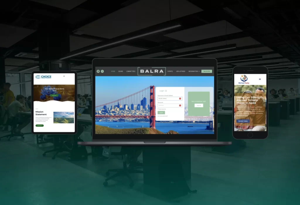
In today's digital age, having a website that adapts seamlessly to different devices and screen sizes is no longer a luxury but a necessity. Mobile Web experience has become just as important as desktop with various viewport widths for difference mobile devices. For this reason, it is important to make sure your web developer incorporates responsive web design. Responsive web design is an approach to designing and developing websites that ensures optimal viewing and interaction experiences across a wide range of devices, from desktop computers to smartphones and tablets. In this ultimate guide, we will explore the principles, benefits, techniques, and future trends of mobile design and responsive behavior based on screen size.
Current web best practices used to create websites includes creating a design and layout that automatically adjusts the layout, content, and functionality optimized for mobile devices. With the increasing use of mobile devices, creating a mobile version of your website for increased usability is imperative to success in the digital space.
Device hardware and web browser experiences have a direct correlation. A static web version of the website may look magnificent only according to the width of the screen. When you create a website that does not adapt to various screen sizes, many future visitors will have a poor experience on your site because it was meant for larger devices. Also, when you avoid making a mobile version of their website, without optimizing HTML and CSS you can end up with a website with slow loading times, distorted layouts, and frustrating experiences, ultimately driving users away.
To make a design responsive, several key principles should be considered. This includes using a flexible grid, and considering how to resize elements and create basic layout alterations to be able to create a pleasurable experience regardless of the size of the screen. For online experiences, design isn't about only one perspective, it is also about choosing a layout that would best suit small devices as well as large devices.
Responsive web design offers numerous advantages for both website owners and users. By providing an enhanced user experience, responsive websites lead to higher user engagement, increased mobile traffic, and improved conversions. Additionally, maintaining a single website that caters to all devices simplifies updates and reduces development costs. By using css to make your website perform well on any screen or browser, you significantly improve your website without extra plugins or softwares. From an SEO perspective, responsive design can boost search rankings and increase visibility on search engine result pages.

Without testing the capabilities of the device, there are practical techniques and tools used in responsive web design. CSS frameworks provide a solid foundation for responsive layouts. Responsive images and videos adapt to different screen sizes without sacrificing quality. One design key factor is using techniques to resize images proportionately. Media queries and breakpoints enable developers to specify design changes based on device characteristics. Designing for touch interfaces ensures seamless interactions on touchscreen devices, while device testing and emulation are crucial for ensuring consistent experiences across different platforms. Work with media queries to create a single-column layout when necessary.

Responsive design is becoming increasingly important for any website or application seeking to reach a broad user base. Design is also about user experience and evoking of a feeling from the audience. What you need to know about responsive layout to a single-column is that it works well on a new screen in portrait orientation. Responsive content and design refers to the ability of a site or application to adjust its layout and functionality based on the size and orientation of the display screen. Non-responsive design, on the other hand, is fixed in its layout and functionality, which can lead to difficulties for users accessing a site or app on smaller screens or different devices. Non-responsive design is generally meant for large devices. Building a responsive design takes careful planning, design and development, but the added effort is worth it to ensure a positive user experience on any device. The best web design agencies use css style with developer tools to adjust styling for all platforms and screen sizes.

While responsive design brings significant benefits, it also presents challenges that need to be addressed. Content prioritization and hierarchy become critical to deliver relevant information effectively. Navigation and menu design require careful thought to ensure ease of use on various devices. Performance optimization techniques, such as image compression and code minification, are essential to maintain fast loading speeds. Cross-browser and cross-device compatibility, as well as accessibility considerations, should be taken into account for an inclusive user experience. When designing for a universal browser window, make sure that the focal point of the section is always at the center of the screen, regardless of the device they are using.

To make web pages render well on all devices is a crucial factor that determines the success of any website. With the increasing number of users accessing web pages through different devices, it is important to keep in mind the best practices while designing a responsive website.
Firstly, mobile-first design is essential, as most of the website traffic now comes from mobile devices. Mobile-first design is crucial in today's digital landscape due to the significant increase in website traffic from mobile devices. With the advancements in technology and the widespread use of smartphones and tablets, more and more people are accessing the internet through these portable devices. As a result, website designers and developers must prioritize creating mobile-friendly and responsive designs to cater to this growing audience. Mobile-first design focuses on providing users with an optimal experience on smaller screens, ensuring that the website is fully functional and visually appealing across various devices. By adopting a mobile-first approach, businesses can reach a wider audience and enhance user engagement and satisfaction. Moreover, search engines like Google now prioritize mobile-friendly websites in their search rankings, making it even more critical for brands and businesses to embrace mobile-first design. Ultimately, mobile-first design is no longer an option but a necessity in order to adapt to the changing digital landscape and remain competitive in today's mobile-driven world.
Construct a simple and clear website architecture is necessary to ensure easy navigation. A clear website architecture ensures that users can easily navigate through the site and find what they are looking for. A clear website architecture plays a crucial role in enhancing user experience. It ensures that users can easily navigate through the site and find what they are looking for. By organizing the website's content and pages in a logical manner, visitors can quickly locate the information they need, reducing frustration and improving satisfaction. A well-structured website utilizes categories, subcategories, and menus to create a hierarchical structure that guides users seamlessly from one section to another. Additionally, implementing clear and intuitive navigation elements such as menus, search bars, and breadcrumbs further enhances the user's ability to find specific pages or information. A website with poor architecture, on the other hand, can lead to confusion and a high bounce rate as users struggle to navigate and leave the site in frustration. In conclusion, a clear website architecture is essential for providing users with a positive browsing experience and ensuring they can easily access the content they need.
To optimize images and assets for different devices and loading times, convert and resize images to their display size, so users don't have to download larger files than necessary. In order to ensure optimal performance and fast loading times on different devices, it is crucial to optimize images and assets by converting and resizing them to their display size. By doing so, users are not required to download larger files than necessary, resulting in a better user experience. When images are not optimized for different devices, this can lead to slower loading times, increased bandwidth usage, and potential frustration for users. By converting and resizing images, the file sizes are reduced, making it quicker and more efficient for users to download them without sacrificing image quality. This approach is particularly important for responsive web design, where websites need to adapt to different screen sizes and resolutions. By optimizing images and assets, developers can ensure that the website performs well across various devices and loading speeds, ultimately leading to a more seamless and enjoyable user experience. Also ensure that images and assets are optimized for different devices and provide faster loading times, resulting in an improved user experience.
Make sure text is easy to read without zooming in and out, and typography should be consistent throughout the website. It is important to ensure that the text on a website is easy to read without the need to constantly zoom in and out. This can be achieved by selecting a suitable font size and type that is legible and visually appealing. By making the text easily readable, users will be able to navigate through the website effortlessly and enjoy a seamless browsing experience. Additionally, it is crucial to maintain consistent typography throughout the entire website. This means using the same font styles, sizes, and colors for headings, subheadings, body text, and any other text elements. Consistency in typography not only contributes to the aesthetic appeal of the website, but it also helps users in quickly identifying and comprehending the content. Implementing these practices ensures that users can easily read the text on a website without the need for constant adjustments, improving user satisfaction and overall usability.
Test the website across different devices and screen sizes and make changes accordingly to ensure the website has fulfilled responsive design principles. In order to ensure that a website has fulfilled responsive design principles, it is essential to test it across different devices and screen sizes. With the rise of mobile and tablet usage, it is crucial for a website to adjust its layout and functionality accordingly to provide a seamless user experience. By testing the website on various devices such as smartphones, tablets, laptops, and desktops, one can identify any inconsistencies or display issues that may arise. This testing process allows for adjustments to be made to the website's design, ensuring that it functions optimally across all devices. It is important to consider factors such as font size, image scaling, navigation menu placement, and button size to create a visually pleasing and user-friendly experience. By prioritizing responsiveness, a website can cater to a wider audience and improve overall user satisfaction.
By following these best practices, website owners ensure a seamless user experience, improved search engine rankings, and increased conversion rates.

As technology continues to evolve, new trends in responsive web design emerge. Mobile-first indexing by search engines prioritizes mobile-friendly websites for better search rankings. Progressive web apps (PWAs) provide an app-like experience on the web, combining the best of both worlds. Accelerated Mobile Pages (AMP) technology enables lightning-fast page loads on mobile devices. Voice user interface (VUI) integration allows users to interact with websites using voice commands, while gesture-based interactions create intuitive user experiences.

Creating a responsive website means designing with a varying viewport size in mind. In order to handle the different sizes of your website on different devices, you have to use responsive breakpoints. These breakpoints rely on specific media queries to change the layout based on the width of the viewport. Responsive breakpoints allow your website to look good on both large desktop screens and small smartphone screens. There are three types of breakpoints, including small, medium and large screen sizes. You can work with different CSS frameworks like bootstrap or create your own breakpoints to ensure your website looks good at all sizes. To make sure your website remains responsive, it is essential to test the design across devices and use testing tools like BrowserStack. Implementing responsive breakpoints may seem challenging, especially for beginners. However, with some practice and planning, you can make your website fully responsive, ensuring your website offers a great user experience across all devices.

Keeping consistency in your assets is crucial when designing responsive websites. Two fundamental elements that should never be overlooked: responsive typography and images.
To maintain a consistent user experience across multiple devices, typography must be flexible. It should be able to adapt to different screen sizes, resolutions, and orientations. One way to achieve in a more convenient way is to use relative units like em, rem, or vw that allow the typography to scale proportionally.
However, Typography is not the only thing that must be considered. Images also represent an essential piece in responsive design. To avoid enlarging images that increase page load and reduce the user experience, images must be optimized for each device. In this sense, there are different solutions for the same problem, like implementing an adaptive images plugin.
By keeping consistency in typography and images, you enhance the user experience across different devices. Whether it's a mobile phone or desktop computer, your content remains legible and visually attractive.
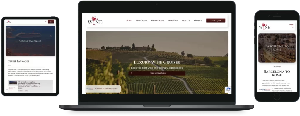
In this example, the Tona Designs staff designed a website experience that works well on all devices. This website was intended for a cruise and travel agency called Cruise 4 Wine. The website designed by Tona Designs for Cruise 4 Wine aims to provide a seamless and user-friendly experience across all devices. The goal is to ensure that users can easily access and navigate the website, whether they are using a desktop computer, smartphone, or tablet.
To achieve this, Tona Designs incorporated responsive design techniques, which allow the website to automatically adapt and adjust to different screen sizes and resolutions. This ensures that the website's layout, content, and functionality remain consistent and optimized for each device.
The website features a clean and modern design with intuitive navigation. The homepage showcases stunning images of cruise destinations and vineyards, enticing visitors to explore further. Tona Designs also implemented a user-friendly booking system, allowing users to easily find and book their desired cruise and wine tours.
Additionally, the website incorporates a responsive menu that collapses and expands, depending on the user's device. This ensures that users can easily access different sections of the website, such as cruise itineraries, wine destinations, and customer reviews, regardless of their screen size.
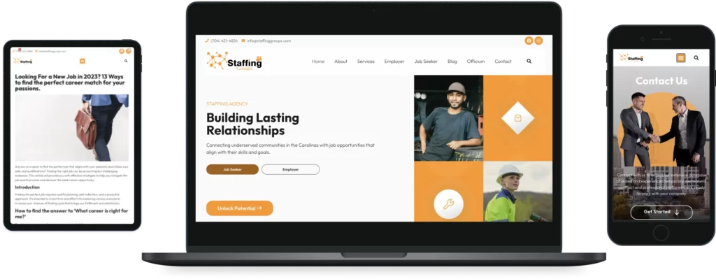
The Tona Designs staff teamed up with the Premier Marketing staff to design and develop this staffing agency website based out of Charlotte, NC. The Tona Designs staff collaborated with the Premier Marketing team to create a staffing agency website located in Charlotte, NC. The combined expertise of the two teams resulted in the design and development of a highly functional and visually appealing website.
Tona Designs brought their proficiency in user experience design and web development, while Premier Marketing contributed their knowledge in marketing strategies and content creation. The website showcases a user-friendly interface that allows clients to easily navigate and search for job opportunities. It is designed to attract potential candidates and encourage them to submit their resumes and apply for available positions.
The collaboration between Tona Designs and Premier Marketing ensured that the website not only met the needs of the staffing agency but also incorporated effective marketing techniques to help the agency reach a wider audience. This website has two major functionalities: connected eager candidates with enthusiastic employers, and find positions for motivated job-seekers.
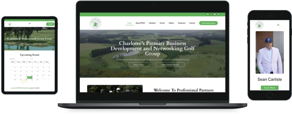
The Tona Designs staff paired up with Premier Marketing to design and develop this membership-based platform for a Golf Networking Group - PPGG. The Tona Designs staff collaborated with Premier Marketing to create a membership-based platform for the Golf Networking Group - PPGG. This partnership resulted in an innovative and user-friendly platform that caters specifically to golf enthusiasts. The platform, designed and developed by Tona Designs and Premier Marketing, offers a range of features and functionalities that enhance the overall golfing experience for members. Users can easily connect with other golfers, schedule tee times, and access exclusive discounts and offers from various golf courses and sporting goods companies. The PPGG platform also provides a forum for members to share tips, experiences, and discuss relevant topics. With its sleek design and intuitive interface, this platform effectively brings together golf enthusiasts from different backgrounds and skill levels, fostering a sense of community and camaraderie among members. Tona Designs and Premier Marketing's collaboration has undoubtedly revolutionized the way golfers connect and engage with each other in a digitally interconnected world.

The future of responsive web design holds exciting possibilities. With emerging technologies and innovations, websites will become even more adaptable and personalized. Integration with the Internet of Things (IoT) will enable seamless experiences across multiple devices. Responsive design will continue to evolve as new devices and user behaviors emerge, demanding flexibility and creativity from designers and developers.
Here are some forums to learn more about responsive web design: If you want to learn more about responsive web design, there are a variety of forums available online.
One popular place to start is the Responsive Design Forum, which is a community of web designers and developers who are passionate about creating responsive websites.
This forum features discussions about the latest trends in responsive design, tips for creating responsive sites, and advice on how to make sure your site is optimized for all devices.
Another great resource is the CSS-Tricks forum, which has a dedicated section on responsive design. This forum provides a space for designers to share their experiences and ask for help with specific design challenges.
Additionally, the Web Design Ledger forum is another option for those who are looking to dive deeper into responsive design. With so many forums available, there is no shortage of resources for those who want to improve their knowledge of responsive web design.

Responsive web design is no longer a choice but a necessity for businesses and organizations that strive to provide a seamless user experience across all devices. By implementing the principles, techniques, and best practices of responsive web design, businesses can engage their audience effectively, improve their online visibility, and stay ahead of the competition in the digital landscape.
Responsive web design focuses on creating websites that adapt to different screen sizes and devices, providing a consistent experience across platforms. Mobile app development involves building native or hybrid applications specifically for mobile devices, leveraging device-specific features and capabilities.
Responsive web design can improve SEO by providing a single URL for all devices, eliminating the need for separate mobile sites. This consolidation of web presence enhances the website's authority, streamlines the indexing process for search engines, and improves organic search visibility.
While responsive web design offers many benefits, it can sometimes result in compromises in terms of performance optimization and complexity. Designers and developers need to carefully balance aesthetics, functionality, and performance to ensure an optimal user experience.
Responsive web design is suitable for most websites, including e-commerce stores, blogs, news sites, and corporate websites. However, some complex web applications with specific requirements may benefit from other approaches, such as adaptive design or separate mobile apps.
It is recommended to regularly test responsive websites on various devices, screen sizes, and browsers to ensure consistent experiences. Testing during development, as well as periodic checks after updates or changes, helps identify and fix any compatibility issues.
A responsive breakpoint is a point in a website's layout where the design and content must adapt to accommodate different screen sizes. Responsive breakpoints are typically set by designers and developers to create a seamless user experience across multiple devices, such as desktops, tablets, and mobile phones. Expert web developers use media queries to create responsive grid layouts. When the screen size reaches a certain breakpoint (css media queries) , the website's layout will change to fit the screen's dimensions and resolution. This is why mobile responsive layouts are entirely based on proper use of css.
How To Improve Your Website’s Loading Speed Through Design
Minimizing HTTP requests
Optimizing images
Compressing files
Reducing the use of external resources
Using content delivery networks (CDNs)
Leveraging browser caching
Using lazy loading
#WebDesign #DigitalMarketing #SEO #UserExperience #BrandIdentity #tonadesigns
May 19

The Do’s and Dont’s of Website Design for Small Businesses
When it comes to designing a website for a small business, there are certain do’s and don’ts that should be followed to ensure that the website is effective and meets the needs of the business. In this article, we will explore some of these do’s and don’ts to help small business owners create a website that is both functional and visually appealing.
#WebDesign #DigitalMarketing #SEO #UserExperience #BrandIdentity #tonadesigns
May 16
Motivational Quote For Your Hump Day!
“ If you want a thing done well, call on some busy person to do it. Busy people are generally the most painstaking and thorough in all they do ” - Napoleon Hill
#business #entrepreneur #businesstips #digitalmarketing #businessstrategy #success #motivation #grantcardone
Mar 1
8 Tips for Starting Your First Business!
Swipe to learn more →
Thank you for reading!
#business #entrepreneur #businesstips #digitalmarketing #businessstrategy #elonmusk #grantcardone #billionaire #patrickbetdavid #tonyrobbins #valuetainment #businesstips #smallbusiness #palmsprings #coachellavalley #tonadesigns #tonabusinessblog
Feb 28
11 Secrets for Growing Your Business Quickly
1. Hire The Right People
2. Focus on established revenue sources.
3. Reduce your risks.
4. Be adaptable
5. Focus on your customer experience.
6. Invest in yourself.
7. Always think ahead.
8. Prioritize Customer Service
9. Establish a social media presence
10. Attend networking events.
11. Research your competitors.
Thank you For Reading!
#businessgrowth #business #entrepreneur
Feb 1
In the rapidly evolving landscape of business, digital marketing has emerged as a pivotal tool for driving success. Local companies, in particular, are recognizing the

What are backlinks? How to Get Backlinks in SEO. Off-Page Backlink and Types of Backlinks Explained.
Understanding Backlinks: The Cornerstone of SEO Success In the ever-evolving landscape of digital marketing, the term “backlinks” has become nothing short of a buzzword. Yet,

What is ROI? Return on Investment Explained
In the world of business, understanding your investments’ returns is crucial. ROI, or Return on Investment, is a fundamental metric that helps businesses measure the
Web design is a captivating journey into the digital world that involves creativity, functionality, and innovation. If you’re new to the concept of web design,
WordPress has emerged as one of the most popular content management systems (CMS) and website-building platforms globally. It empowers both beginners and experienced users to

How Digital Marketing Can Scale Your Business. Grow With A Digital Marketing Agency
Introduction In today’s fast-paced and technology-driven world, digital marketing has become an indispensable tool for businesses seeking growth and scalability. By harnessing the power of